Die Sahara auf Besuch, oder: 84.000 Tonnen Sand in der Stunde

Image

Die Sahara war auf Besuch, selbst in Wien liegt noch überall der Staub – dabei waren wir gar nicht so sehr betroffen wie einige unserer Nachbarn.


(Tagesaktuelle Karten dazu gibt es von Copernicus)

Aber wie viel Staub ist das eigentlich, der da so herüberströmt aus der Sahara?

Nicht wenig – zwischen 22 und über 23 Tonnen pro Sekunde (84.000 Tonnen pro Stunde) traten am Höhepunkt — am 15.4. mittags — über den 38 Breitengrad zwischen 8 und 28° östlicher Länge.

Die beiden Zahlen stellen einmal den gesamten Staubfluss dar, das andere Mal den “Nettoimport”, jeweils für den gesamten betrachteten Abschnitt – der Nettoimport ist niedriger, da es zu jedem Zeitpunkt zumindest punktuell auch Nordwind gab. Er ist aber nur geringfügig niedriger, da die dann meist weniger Material mitführen als die zeitgleichen Südwinde frisch aus der Sahara in anderen Abschnitten(1).


Das European Centre for Medium Range Weather ForecastsEuropean Centre for Medium Range Weather Forecasts stellt nach einer kostenlosen und unkomplizierten Selbstanmeldung ganz brauchbare Rohdaten zur Verfügung(2). Ich hab mir also für 13.-17.4., jeweils mitternachts und mittags, folgende Datentypen runtergesaugt:

  • Staubkonzentration (in drei Subkategorien je nach Korngröße, in Gewichtsanteilen)
  • Die Nord-Süd-Komponente der Windgeschwindigkeit (“V component of wind”, als solche in den Rohdaten, erspart mir die Trigonometrie)
  • Temperaturen
  • “Geopotential Heights”

Die Temperaturen sind notwendig, da sie die Dichte der Luft mitbestimmen, und damit miteinbezogen werden müssen, um von den Gewichtsanteilen Staub (kg/kg) zu Staubkonzentrationen pro Volumen (kg/m3) zu kommen (kg Staub / kg Luft * kg Luft / Kubikmeter = kg Staub / Kubikmeter).

Die “Geopotential Heights” sind notwendig, weil die Schichten in den Rohdaten nicht nach Höhe über dem Boden sondern nach Isobaren aufbereitet sind: Nach Schichten mit gleichem Luftdruck. Um also die Staubkonzentrationen je Höhe zu bekommen, und damit auch die Basis für die Interpolation für alle anderen Höhen, muss ich erst die Geopotential Heights abfragen.

Ich rechne also für jede Lokalität die summierten Staub-Gewichtsanteile je Isobare * Luftdichte je Isobare, um auf die Staubkonzentration je Isobare zu kommen, mulitpliziere diesen Wert mit der Nord-Süd-Komponente de Windgeschwindigkeit je Isobare, um auf die Transportrate über den Breitengrad hinweg zu kommen (in kg pro Meter der gedachten Linie und pro Höhenmeter der Luftsäule). Diese Werte plotte ich gegen die Höhen der jeweiligen Isobare und bestimme auf dieser Basis eine Interpolationsfunktion, die mir für jede Höhe eine geschätzte Staub-Transportrate gibt.

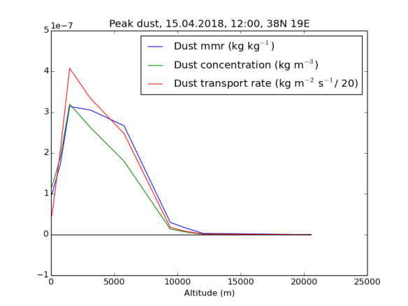
Hier sind diese drei Zahlen — Staub in Masseanteilen, Staub in Masse je Volumenseinheit, und Staubtransport je Höhenmeter je Meter Grundlinie je Sekunde  — für den Ort und Zeit der höchsten Transportrate nach Höhenschichten aufgelöst dargestellt. Die blaue Linie stellt den Masseanteil (mass mixing ratio) von Staub an der Luft dar. Man sieht, dass der sich bis auf eine stattliche Höhe von mindestens 6000 Metern im – sehr hohen – Bereich von mehreren hundert Mikrogramm/kg (oder ppbm) bewegt. Die grüne Linie, der Staub je Kubikmeter, sinkt dagegen schon vorher stark ab, da auf diesen Höhen die Luft schon deutlich dünner ist. Die rote Linie stellt die eigentliche Grundlage der Berechnung dar: Den pro Zeiteinheit nach Norden transportierten Staub. Um sie in der gleichen Grafik darstellen zu können, musste ich sie um einen Faktor von 20 herunterskalieren: An diesem Ort herrschten am 15.5. mittags über einen breiten Höhenbereich hinweg Winde mit einer Nordkomponente von 20-25 m/s und mehr vor.

Peak_dust

Je Lokalität und Zeitpunkt ergibt sich daraus eine Kurve, die den Materialtransport  in nördlicher (positive Werte) oder südlicher Richtung abhängig von der Höhe beschreibt. Hier beispielhaft die entsprechenden Kurven für 15° Ost (östliches Sizilien) und 24° Ost (Athen):


Bereits zu Anfang des untersuchten Zeitraums herrschen in Sizilien Südwinde (mit dem Potential, Staub nach Norden zu transportieren) vor, die allerdings noch verhältnismäßig wenig Staub transportieren. Erst um den 14. April mittags geht die Menge des transportierten Staubs sprunghaft nach oben, am 15. April mittags wird der Höhepunkt erreicht, kurz darauf dreht aber auch schon wieder der Wind (und damit fallen auch die Staubmengen wieder). Anders in Athen, hier herrschen bis zum Morgen des 15. noch Nordwinde vor, erst am 15. dreht der Wind auf Süd, die höchsten Staubwerte werden hier erst am 16. erreicht.


===================

(1) Hier nochmal der jeweilige lokale Netto-Staubtransport aufgedröselt für jeden einzelnen Längendgrad. Man sieht sehr gut, dass es (fast) überall zeitweise Nordwinde gab, die aber nirgends soviel Staub transportierten wie die Südwinde zu anderen Zeitpunkten, oder die zeitgleichen Südwinde an anderen Orten. Die X-Achse sind Messzeitpunkte, die Y-Achse der Staubübertritt pro Stunde pro Kilometer des 38 Breitengrads auf der jeweiligen Länge, negative Werte ein stellen Nordwinde und einen Staubtransport in Richtung Süden dar. Der absolute Höchstwert mit fast 160 Tonnen pro Stunde pro Kilometer wird am 15. 4. mittags am 19 Längengrad erreicht – über dem Ionischen Meer, etwa am halben Weg zwischen Kalabrien und Zakynthos.


(2) Konkret habe ich verwendet: TIGGE-Daten für GH, Temperatur und Windgeschwindigkeiten, und CAMS für die Staubwerte. Die Installation der notwendigen Software, um mit den Daten dann auch was anzufangen, war nicht ganz so unkompliziert wie der Zugriff auf diese selbst.

(*) Die Berechnungen sind auf Github dokumentiert.

We’re all Siberians

Counterintuitive as it seems to many, computer models have shown that, with a very high probability, the last common ancestor of all living humans has lived surprisingly recently, maybe as little as 3500 years ago. More recently, genomic testing has helped to validate some of the assumptions underlying these models, showing that a pair of randomly picked individuals from e.g. Hungary and UK share about five *genetic* ancestors as little as ~1000 years back, with translates readily to thousands, if not millions of shared genealogical ancestors.

What I’m doing here is to make an even more minimalistic model: One that does without explicitly modeling large-scale migrations. Instead, all I model is admixture between neighbouring villages. And even with such an impoverished model, pretty much everyone shares ancestors by around generation 160.

East_Siberia67

Red is villages where everyone has ancestors who lived in East Siberia at the beginning of the simulation. Yellow, villages where some people do.


Continue reading

In Which The Earth Takes a Trip into the Kuiper Belt (and Beyond), While Hugging the Moon

Ejecting Earth

In my last post, I presented a simulation where a trespassing rogue gas planet kicks the earth into a more eccentric orbit – all without loosing the moon. Running the model again with a more massive intruder (1/30 solar masses) gave in one instance a scenario where the earth and moon were ejected from the system – still without loosing sight of each other.

This is of course more likely to happen with a more massive body: A less massive body has to come much closer in order to have a chance of significantly altering the Earth’s trajectory. But since gravitational acceleration decreases with the square of the distance, being much closer means that there’s potentially a significant difference between its pull on the moon and its pull on the earth. A more massive body can throw the system off track at a relatively larger distance, where its pull on earth and moon are effectively the same, so it will divert them in the same direction.

At the end of the simulations, 35000 steps of 8 hours each, or roughly 32 years, Earth and Moon are moving away from the inner solar system at roughly 13km/s, already having reached a distance of 78 au – beyond the Kuiper Belt, and way above the escape velocity at that distance from the sun.

Gallery

orbits_Sun-centricInner_solar_system1508071034

The inner solar system, all time. Light blue is the trajectory of one of the brown dwarf’s satellites that gets captured in the solar system, on a highly eccentric orbit with its aphelion in the asteroid belt and its perihelion inside of Mercury’s orbit. The line for the moon all but covers earth’s line.

Continue reading

Breaking things is fun…

orbits_inner1507156824.58_-101.674790891_-35000_-148.649535644_run

A rogue supermassive gas giant throws earth on a highly eccentric orbit. The moon is decidedly unimpressed.

We may not always admit it, but breaking things is fun. But breaking things can also be hard, when those things are massive balls of roughly 6 * 10^24kg of iron and silicates making rounds around even more massive balls of 2 * 10^30gk of plasma. And some things just shouldn’t be destroyed if we want to live on…

Anyways, I wrote a little script suite to try and virtually destroy the Earth nonetheless. What it does is throw a little brown dwarf or large rogue planet (0.01 solar masses, e.g. more than 10 jupiters) at the inner solar system, at a relative velocity of 35 km/s. You’d think that this is the end of the world (and it may well be the end for us if the rogue planet throws a large asteroid at us on its way out — I didn’t really model a lot of asteroids for computation time reasons), but most of the time the result is decidedly boring: If the rogue planet has moons/satellites, it may lose those — but even that doesn’t happen all of the time. If it passes very close to one of the inner planets, it might throw them on very eccentric orbits. In no single iteration — and I’ve run a few during debugging and since, creating 9GB of simulated data by now — does any of our planets get ejected.

The worst that happens is what’s depicted above: On its way out, our rogue planet comes close to earth and throws it on a highly eccentric orbit, so much so that it crosses Venus’ orbit once a year. But even then, the moon keeps hugging the earth. It does get thrown on a slightly more eccentric orbit, but one that’s on average even closer to earth than it used to be. (Left: moon-earth distance over time. Right: polar view of moon’s orbit; the narrow band top right is it’s original, fairly circular orbit — more circular than in reality in fact; the broad band further in is its final eccentric orbit.


So I’m wondering: maybe it’s actually possible to eject the earth-moon system from the solar system without breaking it up? I guess I’ll have to run a few simulations with a more massive trespasser to find out…

Just for fun, the result of a different simulation: Here, the sun seems to be able to hold on to one of the rogue planet’s satellites — on a comet-like, mercury-crossing orbit (black ellipsis). All distances in metres from sun.

orbits1507153604.96_-561.953258129_-35000_4.67450472052.png

On smurfs – playing around with genetic drift in a spatially structured population

A lot of people seem to struggle with the idea that stochastic processes can produce deterministic outcomes on grand scales. A prime example is genetic drift and how its results (and it’s interactions with silent mutations) can be used to assess past population structures and sizes.

As I’m increasingly finding that a good way to better understand a concept is to build it into a little model where you can tweak the parameters at your will (and also as an exercise in try-except-constructions and classes), I’ve written some Python code that simulates neutral evolution(0). It doesn’t show anything new, but it may be didactical. The bottom line is the following graph, which shows how the diversity of a population (the number of different alleles present) starts to oscillate around a point of equilibrium between mutations introducing new variants and existent once drifting out of the population after a while, the level where that equilibrium is reached being function of the population size and irrespective of initial diversity.

The total diversity (number of different genotypes) of a population over time under 3x2 conditions - different initial diversity and three different population sizes; log-scale on y-axis.

The total diversity (number of different genotypes) of a population over time under 3×2 conditions – different initial diversity and three different population sizes; log-scale on y-axis.

What this little toy of mine can not measure is different types of diversity: In my model, all variants are created equal, and don’t stand in any special relation to each other, so when I assume a possibility space of 100000, if and when a carrier of variant #73489 undergoes a mutation, the result can be any of the remaining 99999 possible variants. In reality, variants form a network of possible transformations, with variants that are closer or more distant from each other. So my model (even if it allowed to change the size of a population over time, which would currently require some ugly hacks) is insufficient to distinguish a large population that is the result of a recent expansion from a medium-sized population from a large population that is the result of a not-so-recent expansion from a small population – both will show less diversity than is expected for their size, from which fact, absent a way to tell different types of diversity apart, we could only conclude (assuming we know the mutation rate and reproduction patterns) is that either of these things must have happened. In reality, one would have (say) hundred different variants most of which are close to each other (converging at just a few right before the expansion started), while the other might have the same number of variants, but those would be more distinct from each other. Another feature of real genomes absent in this simple model is that you can track the variants of multiple genetic loci individually. This allows to diagnose subdivisions of the population when the limits of the ranges of individual variants correlate, which they shouldn’t if sheer distance in an otherwise uniform population is all that’s at work.

These shortcomings notwithstanding, the model is sufficient to see the effect of population size on gross diversity.

The baseline

Let’s start with a very small population, i.e. 50 smurfs.(1) Continue reading

The transition from quantity to quality, in multicolor pictures

In many natural systems, we observe phase transitions, or sudden emergence of qualitatively different behaviour once a certain threshold is reached through gradual, quantitative changes. This insight opens some interesting doors for conceptualising (the evolutionary roots of) human language, but this isn’t the post to elaborate on these. Here, I just want to offer a graphical illustration, using a rather more simple model, of how small, barely perceptible changes of the local properties of a system can drastically change its global properties.

Below, you see black and white pictures of a 2-dimensional random matrix of 0s and 1s, 1s black. The three pictures represent the results for three different probabilities `P` for a dot to become a 1 during the stage in which the matrix is generated, 57%, 59%, and 61%. I dare you to guess which is which without enlarging the images in order to be able to read what it says in the title bar! I know I couldn’t for my life, they all look the same to me.

Bildschirmfoto 2013-04-10 um 01.12.29

Bildschirmfoto 2013-04-10 um 00.47.26 Bildschirmfoto 2013-04-10 um 00.47.38

But exactly within this range of values of `P`, the global property of connectivity or permeability of the system changes in dramatic ways. If, instead of blackening all 1s, we sort them into clusters of mutually connected spots (through paths only using the four main directions), and code those clusters with color, we’ll see that with P-values as high as 0.585, we still get a haphazard assemblage of clusters of various size (in this and the following picture, the single largest cluster is coded black, the second largest red, and for the rest, the other colors are recycled as often as may be necessary, so when you see a large patch of, say, orange, it doesn’t necessarily mean that they’re indeed one and the same cluster, but for black and red you can be sure they are):

Bildschirmfoto 2013-04-10 um 00.49.44

Alas, once we move up to 0.595, the global structure has changed: We’re no longer looking at a multitude of independent clusters of roughly comparable size, but rather at a supercluster that alone alone covers a clear majority of the 1s, with all other essentially just islands within the sea of points that are connected to the the supercluster:

Bildschirmfoto 2013-04-10 um 00.50.08

Not a lot changes when we go further up to 0.6 – the islands just become smaller:

Bildschirmfoto 2013-04-10 um 00.50.50


By just increasing the ratio of ones so slightly that you won’t even notice the difference in a black-and-white representation, we’ve come to the point where you can walk almost anywhere from any starting point without ever stepping on the zeros.

(Code below fold)
Continue reading

Creationist linguistics: It exists

For many years, my only contact with Creationist linguistics was through a parody – a parody of intelligent design in general more than of Creationist linguistics at that. I’m pretty sure that q_pheevr, the author of “The Wrathful Dispersion controversy: A Canadian perspective“, meant to ridicule Intelligent Design proponents by translating their arguments into a realm where they are even more blatantly absurd than otherwise.

Apparently, that’s still not absurd enough for some real folks out there. I particularly love the knots this guy (Wieland, 1999) has to get into within one and the same paragraph:

I think it is misleading to talk about any ‘evolution of language.’ Changes in language come about mostly from humanity’s inventiveness, innate creativity, and flexibility, not from random genetic mutations filtered by selection. And languages studied today in the process of change appear mostly to be getting simpler, not more complex. […] Perhaps ‘devolution’ of language would be a better term.

His factual errors are only icing:

[…] the Sino-Asiatic language family, which includes Chinese, Japanese and Korean […]

Duursma (2002) is if anything even funnier. 

(With a nod to Anatol Stefanowitsch at Sprachlog (German))

Bred to die

Once every while, some creationist will come along who seems to believe that the fact that animals and humans die represents evidence against evolution. The “logic” is that natural selection should inevitably favour longevity/potential immortality since an infinite lifetime means infinite possibilities for reproduction. I’ve always considered this “proof” a proof of the person’s mathematical illiteracy and little else – after all, with any non-zero death rate, the chance to actually survive that long converges to zero with longish finite lifespans, and so does the benefit from potential immortality.

The last time this argument came up, I used the opportunity to practice my new programming skills, so here’s a little script that simulates mortals and “immortals” evolving within the same population. You can play with the parameters, such as extrinsic death rate and rate of reproduction, and decide whether there is a trade-off to (potentially) living longer in terms of slower maturation (there should be, because that’s what we observe in real animals), and whether there’s a bias in life-shortening vs. life-prolonging mutations (there should be, again). We’re pretending that (potential) immortality is actually physically possible for complex organisms, and in fact that once you’re able to survive 160 years, you might as well be immortal.

Here’s what you get when you run the model with biased mutation rates (.003 for life shortening mutations vs. .001 for life-prolonging ones), and no trade-off, and a rate of reproduction of 0.25 per adult per year. We see that there’s a lot of noise, but on the long run the type which lives up to 57 or so years carries the day. Beyond that age, being hypothetically able to live longer doesn’t carry enough of a benefit for selection to overcome the direction of drift when you aren’t going to live that long anyway:

conflated_youngsters

And here’s what you get when you include a very moderate trade-off: The most-short-lived individuals reach maturity at 4 (1 year before they’re bound to die), while the immortals reach it at six, and intermediate degrees of longevity have varying chances of joining the club when they’re in between. In effect, this represents about 10% later maturation per doubling of lifespan, which looks like a very fair deal, but alas this is enough to clearly favour the shorter lived variants over immortals:

percentages_tradeoffandbias

Code below fold. Don’t tell me it’s slow, but feel free to tell me how to make it faster: Continue reading

Hierarchical structures, and linguistic wars

Via Norbert Hornstein’s blog, I came across a recent paper in Royal Society Proceedings B (Frank, Bod, and Christiansen, 2012). In this post, I will present my own two cents on the new “language wars”, focussing on Frank et al.’s arguments against overestimating the roles played by hierarchical structure in language use, and on Hornstein’s treatment or lack thereof as exemplifying the defensive reactions generative linguists often display towards any and all challenges from outside. Continue reading